Ssangyong Infoconn
Project Overview & The Challenge
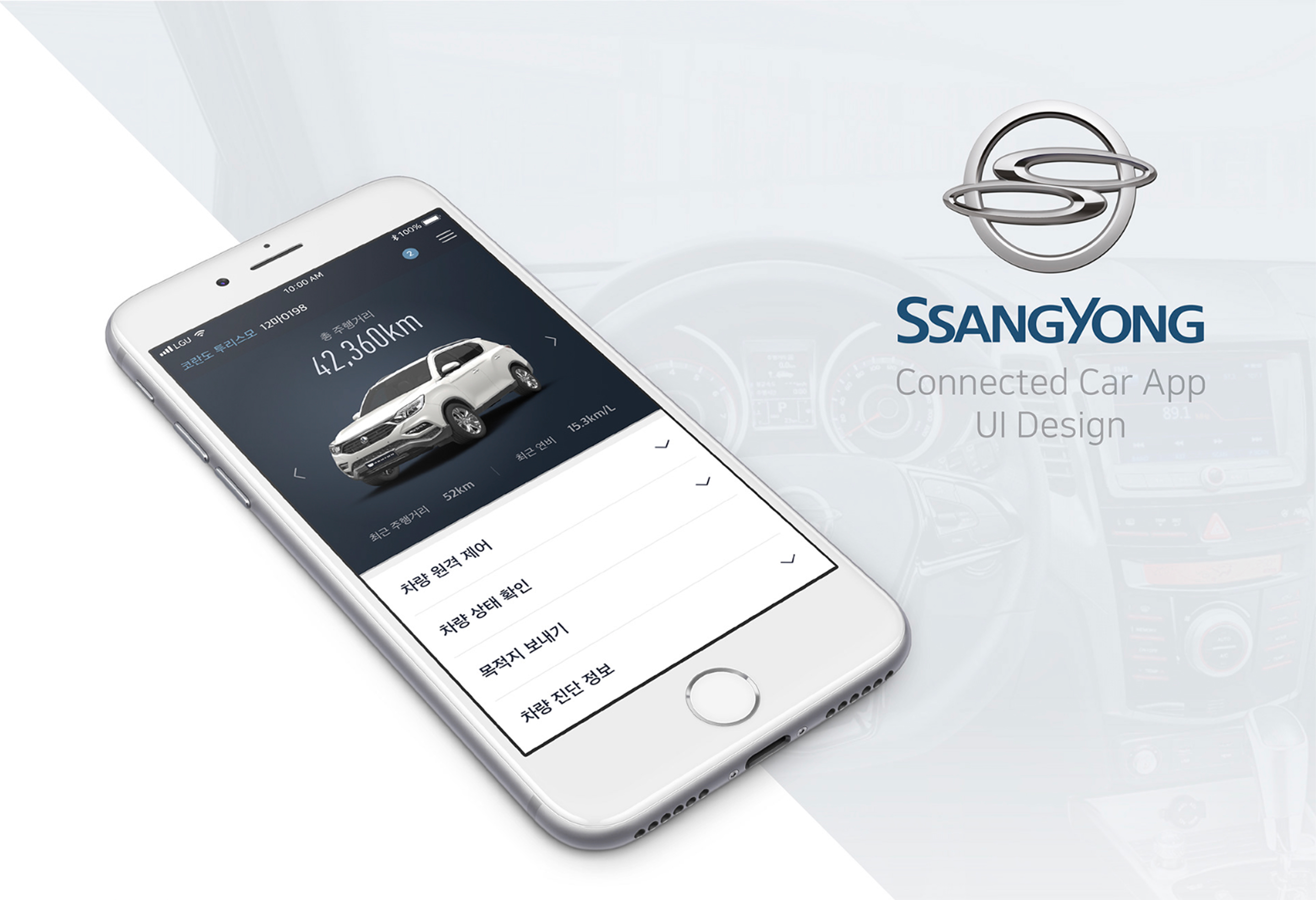
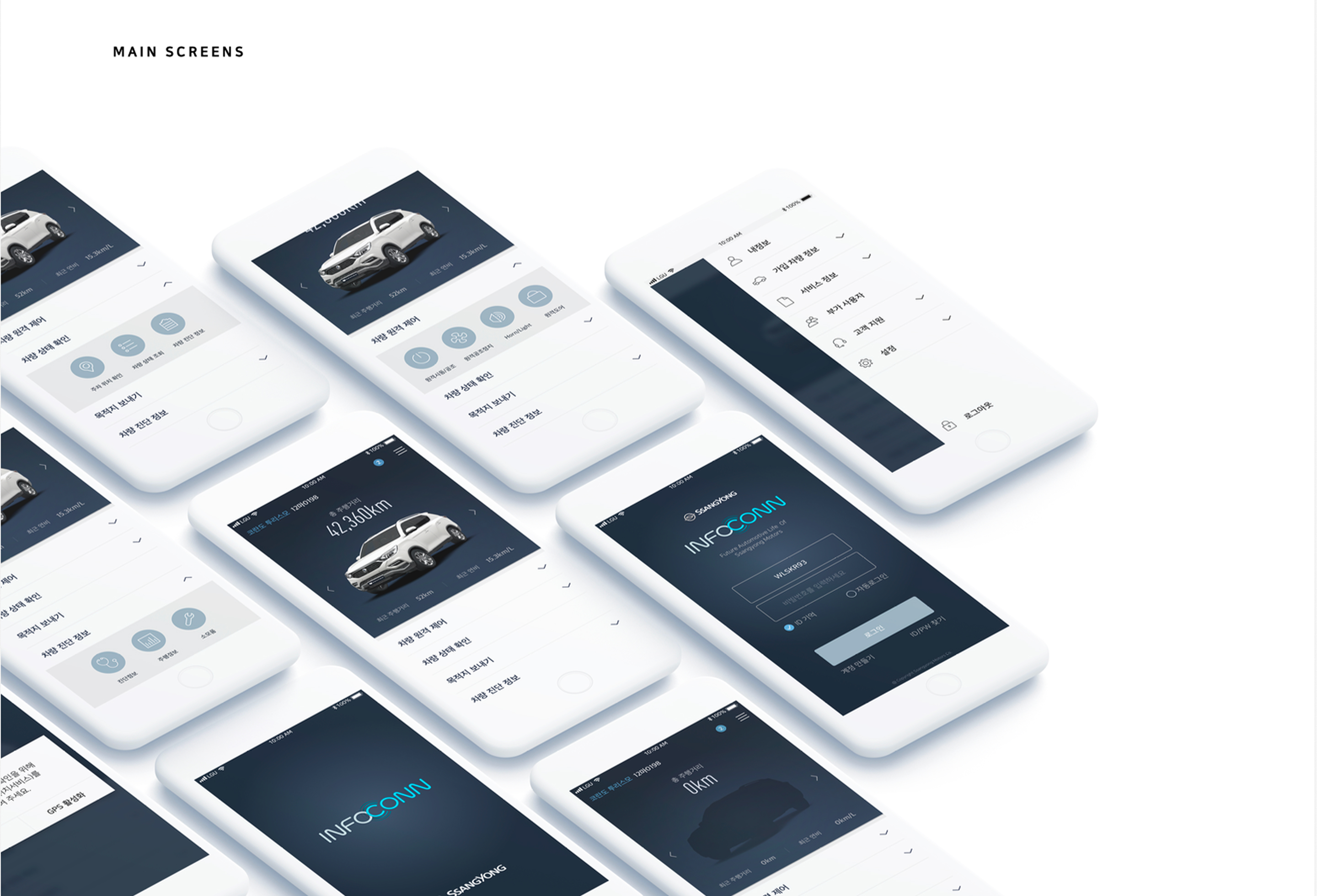
I was hired as a freelance designer by OnePixel to create the user interface for Ssangyong Motors' iOS and Android connected car app. Because the app's structure and functions were already in development, the primary objective was to design the required screens while navigating a complex brand integration.
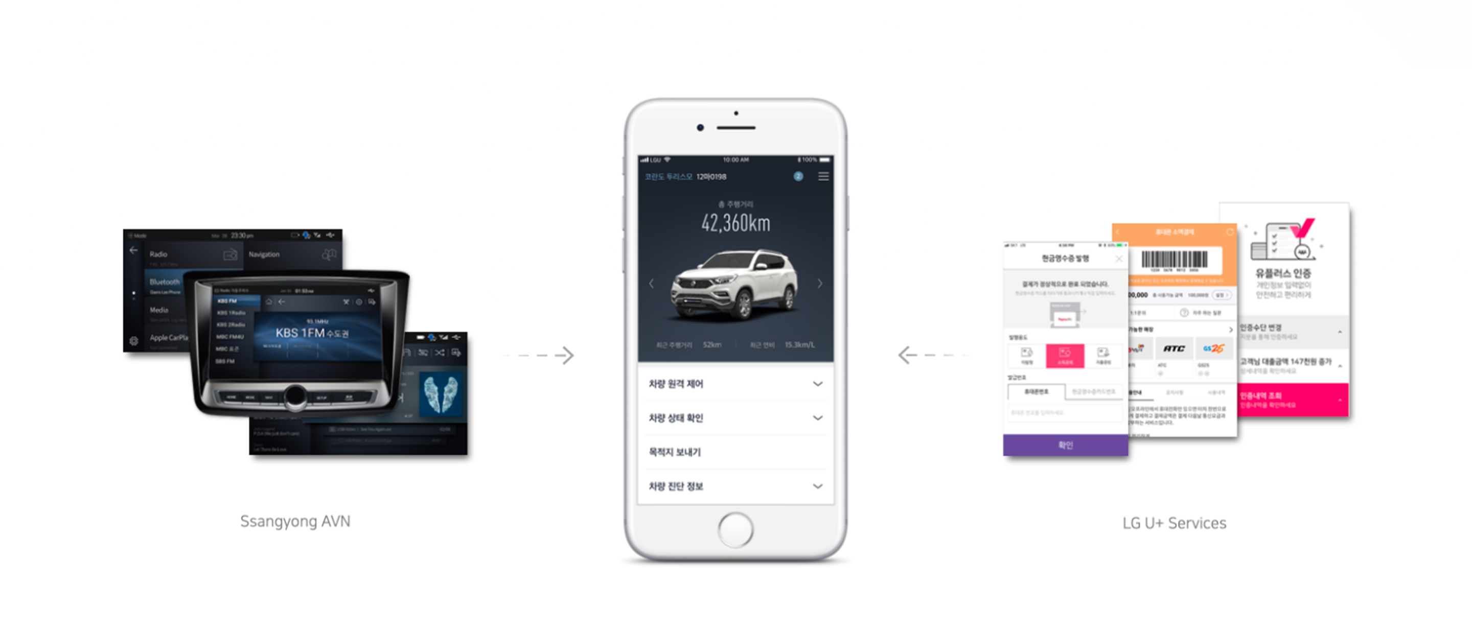
The core challenge was merging two distinct aesthetics for a target demographic of Korean males aged 40 to 70. Ssangyong lacked an established digital identity outside of its in-car AVN (Audio Video Navigation) interface. Conversely, LGU+, the company managing the app's underlying technology, required a bright, flat UI that matched its modern corporate services.
The Iteration Process
- Initial Concept: The first proposal borrowed heavily from Ssangyong's existing AVN system, utilizing its dark color scheme, gradients, and button styles, which were slightly flattened to bridge the gap toward modern app aesthetics.
- First Revision (Light Theme): To accommodate a heavy reliance on menu screens and align closer to LGU+'s white-dominant brand, the UI was shifted to a light background while retaining the structural visual style of the first draft.
- Final Refinement: The design was ultimately pushed to a completely flat interface, replacing the original blue accents with AVN grey. The final delivery focused strictly on refining visual hierarchy, spacing, and typographic details to perfectly match LGU+'s color guidelines and app aesthetics.
Design System & Component Rules
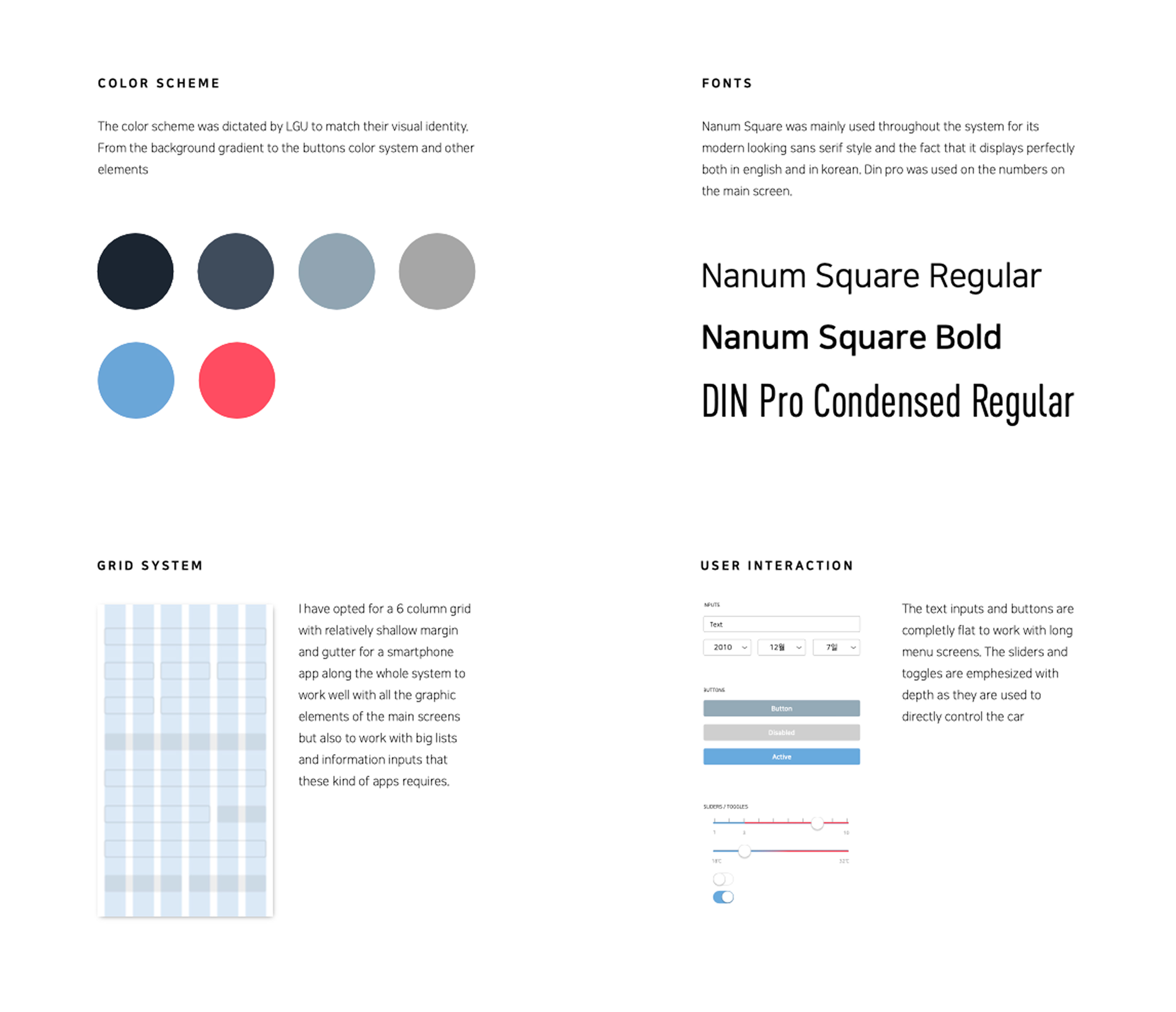
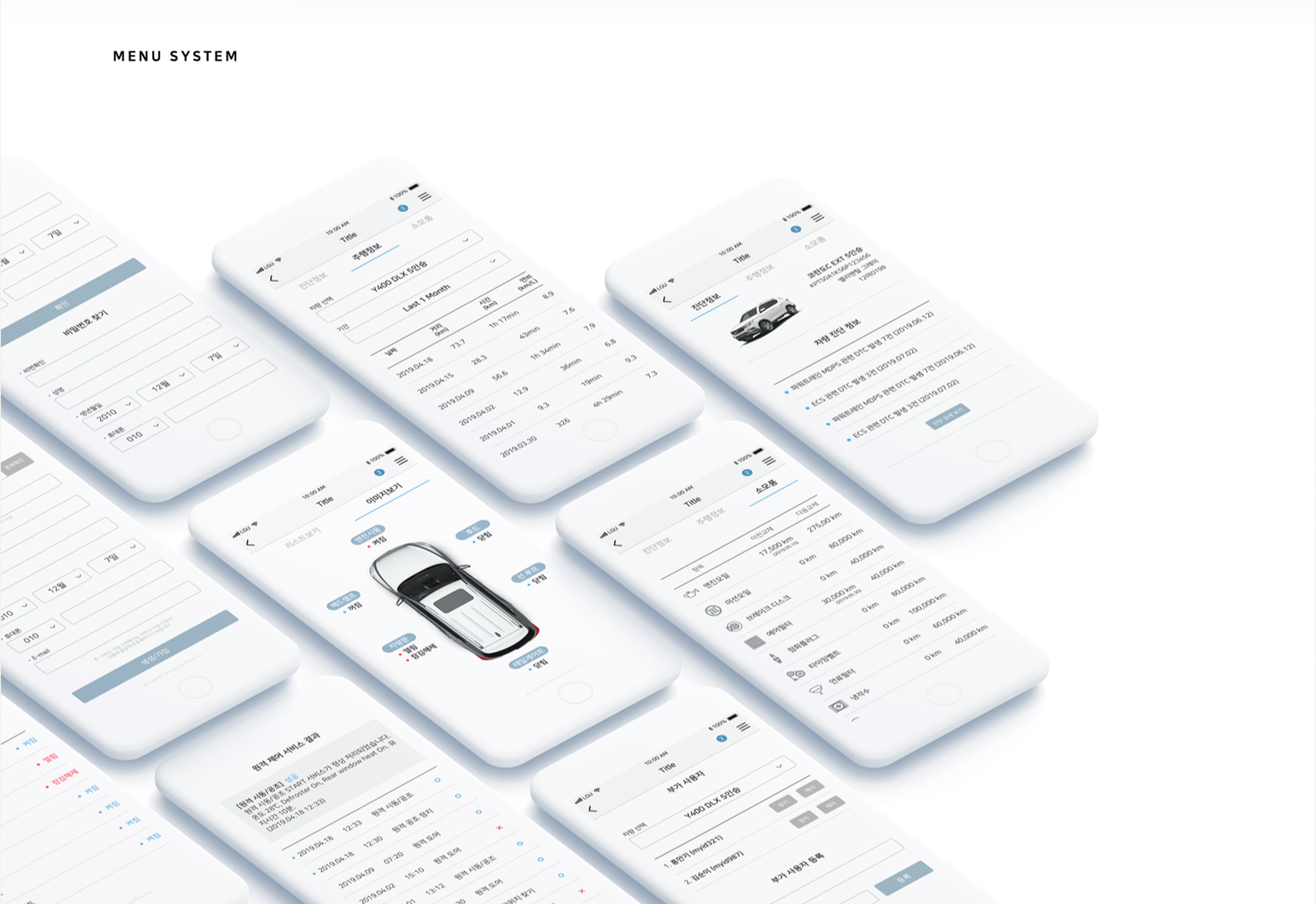
- Grid Layout: A 6-column grid with shallow margins and gutters was implemented. This accommodated both graphic elements on the dashboard screens and the dense data lists required by the app's settings.
- Typography: Nanum Square (Regular and Bold) was chosen for its modern, sans-serif legibility in both Korean and English. DIN Pro Condensed Regular was utilized specifically for displaying numbers on the main dashboard.
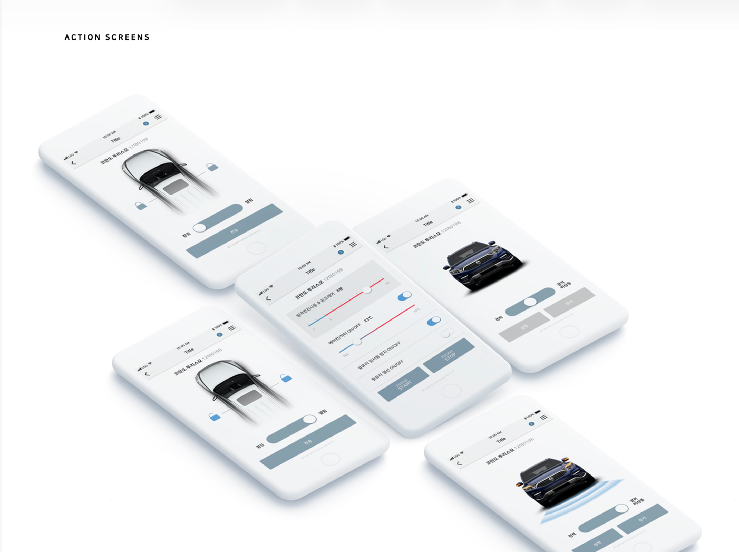
- Interaction Logic: Buttons and text inputs were designed to be completely flat to suit long menu screens. However, interactive toggles and sliders were given deliberate visual depth to signify that interacting with them directly controlled physical vehicle functions.
- Iconography: A custom suite of minimalist, line-art icons was designed to support the navigation and vehicle control features.
Next project →