ThingsBook
Project Overview: ThingsBook by Naver
ThingsBook is a next-generation, English-native social platform designed to capture the Gen Z and Alpha demographics in North America. Unlike previous Naver exports, the platform was built from the ground up to serve as a structured archive of users' genuine interests, directly feeding into Naver's hyper-personalized AI discovery strategy.
The Product Vision: "Record-First, Share-Second"
The core differentiation of ThingsBook is its shift away from the traditional, engagement-optimized social media model.
- Rather than functioning as a public megaphone or a polished showroom, the product serves as a personal archive where the list itself is the primary asset.
- It pioneers a new "lifestyle blog" category that sits squarely between a private, disorganized camera roll and a fully public social feed.
- By optimizing for the user rather than an external audience, the platform prioritizes personal documentation while allowing sharing to occur naturally as a secondary stage.
Core Features & Architecture
The product's architecture relies on categorization and intelligent curation to elevate the user experience:
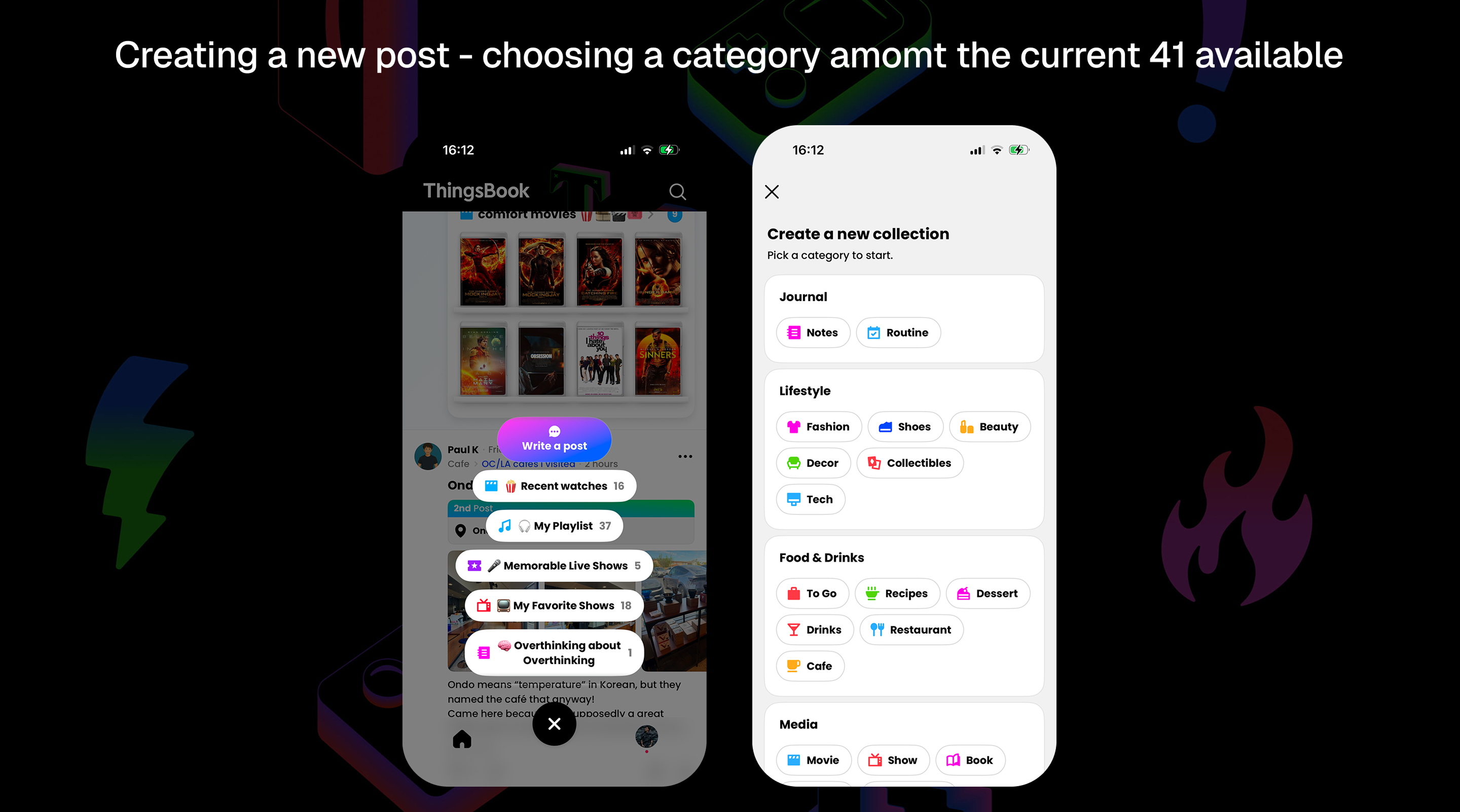
- Structured Categorization: The app launches with 41 curated categories across eight domains—ranging from tangible items like fashion and tech to intangible lived experiences like travel and podcasts—preventing content from becoming an undifferentiated pile.
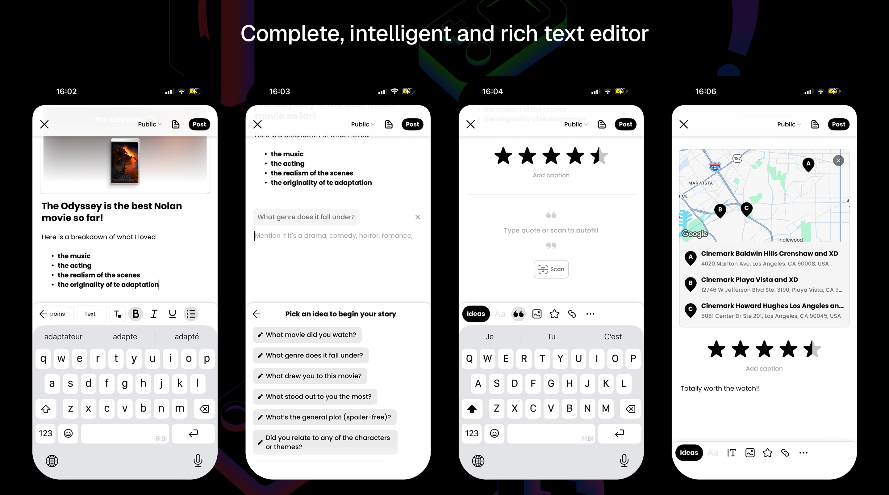
- Intelligent Editor: The posting interface abandons the standard blank text box in favor of intelligent, contextual prompts, OCR capabilities, and rich text styling to ensure professional-quality outputs with minimal effort.
- Frictionless Capture: To support the record-first philosophy, the mobile-first upload process is stripped of unnecessary steps to enable immediate, thoughtless capture on the go.
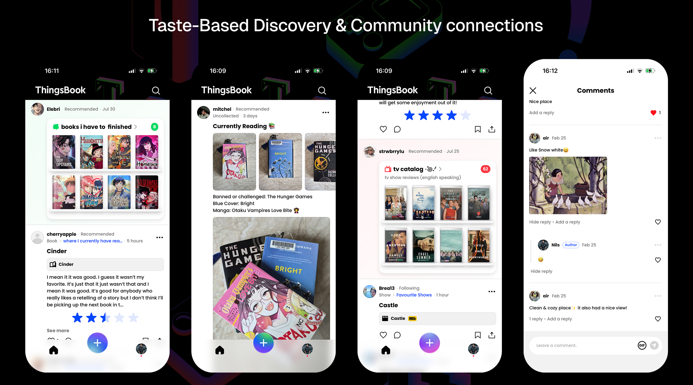
- Taste-Based Discovery: Community connections are formed organically through shared interests and collection browsing, rather than through algorithmic exposure.
The Design Thesis: Fluency Meets Materiality
The UX/UI mission is a delicate balance between intuitive usability and a highly distinct visual identity.
- Operational Fluency: Standard navigation patterns, tab behaviors, and gestures were strictly maintained so that users do not have to learn a new interface just to record an entry.
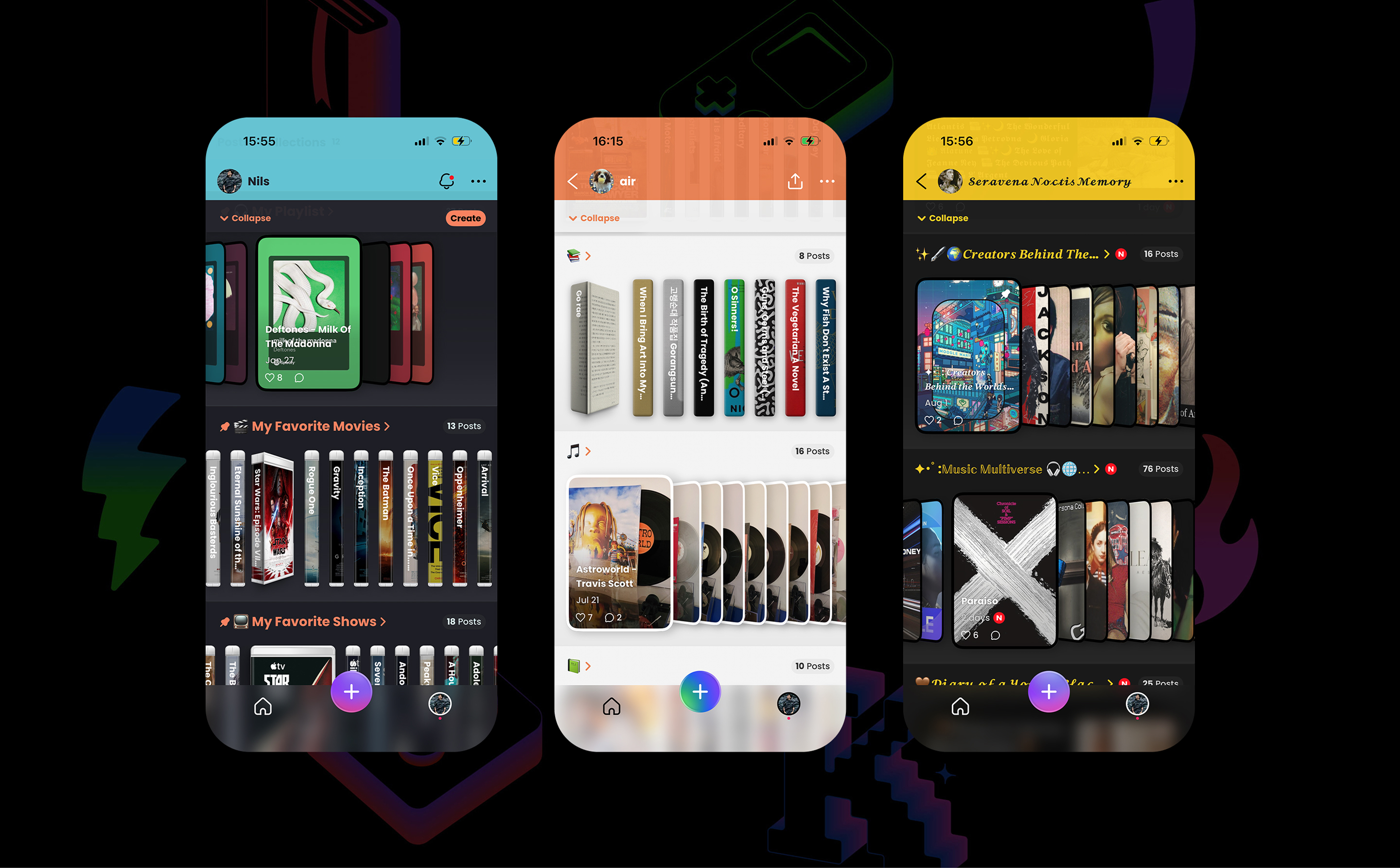
- Visual Materiality: To contrast with the disposable nature of endless scrolling, content is grouped into thematic "Collections" designed to feel like physical objects with weight, edges, and depth.
- Spatial Browsing: Browsing a profile is designed to mimic the feeling of standing in front of a curated bookshelf or stepping into a private study, rather than viewing a highlight reel.
- The Ultimate Goal: The interface must ultimately feel "familiar in the hand, distinct on the page".
Next project →